February 22, 2022
How to: SpecialistFinishes – Tortoiseshell
Cait is a decorative painter working throughout UK and teaching from her studio in Perth, Scotland. You can see her work and connect with her on social media; Twitter and Instagram or Facebook.
Tortoiseshell is an effect that I used a lot back in the 80’s and it is making a resurgence.
I’ve been seeing faux tortoiseshell on glassware, lampshades, lighting, frames, fabric and other interior styling pieces as well as more antique real tortoiseshell pieces used in decorating. Generally used in small areas it packs quite a punch, but it can be used in larger areas too – book matching it is probably the most realistic way to use it. It’s worth doing a Google Search for the Willem Racke Studio Tortoiseshell bathroom to see it used as a finish for a whole room.
In real life tortoiseshell only comes in small pieces because true tortoiseshell traditionally comes from hawksbill turtles. Real tortoiseshell has been banned to protect those creatures, so the faux finish version is a great way today to incorporate new pieces into your own or client’s home.
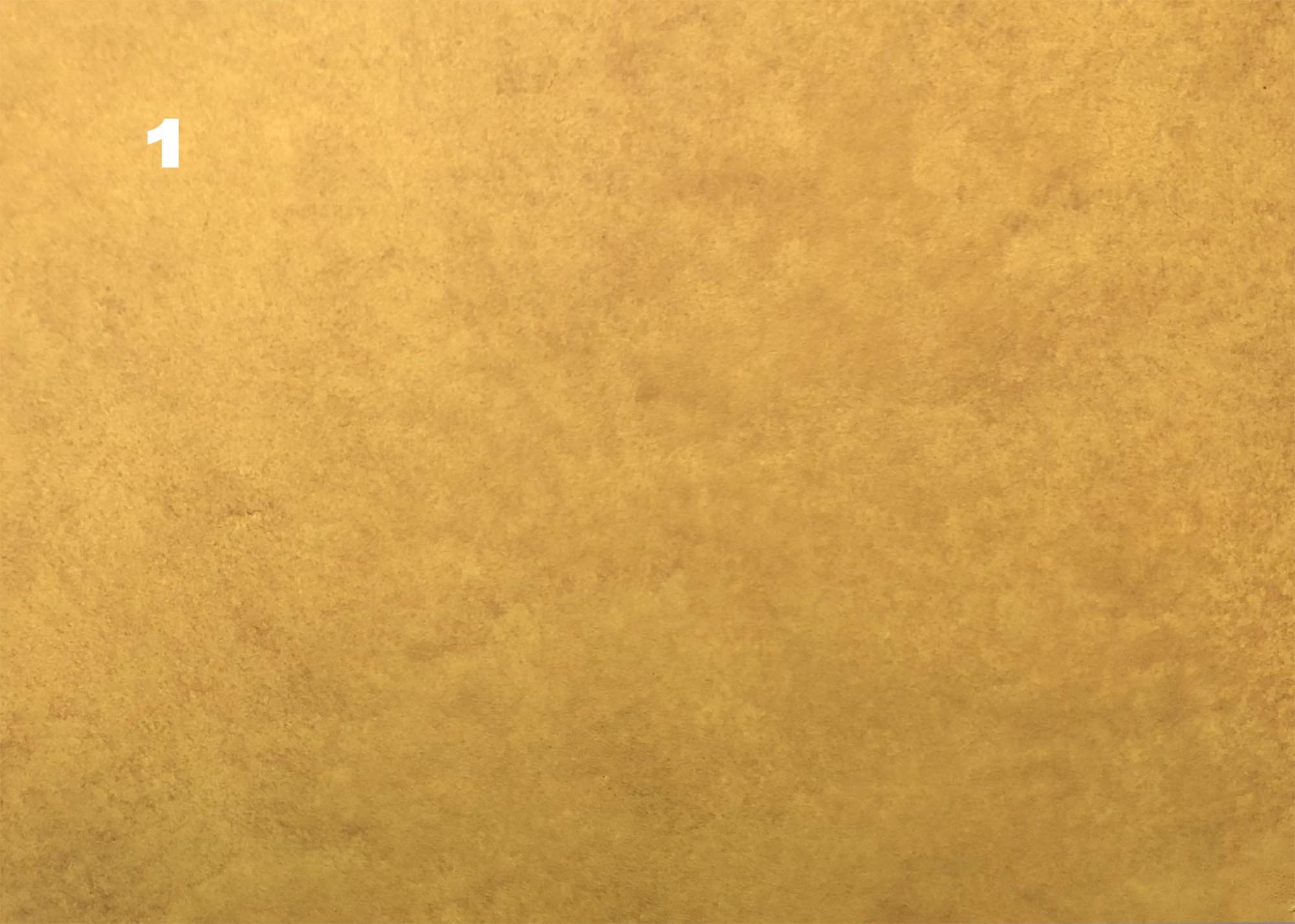
Tortoiseshell comes in lots of tones varying from a pale lemony background to a rich tobacco tone (as well as in a red and green stained version) so I picked a nice jolly yellow in a durable matt – this particular piece was Love In Portofino in Chalky Look from Fleur which is more of a craft paint – in the past I have used BS 10 E 50. I chose a durable matt because I like to work in gouache for the first stage, if you were working in acrylic glaze then you might want to use eggshell.
- Step 1
Mix some Burnt Umber gouache in water and spread this evenly across the surface, stippling it with a large badger brush – this gives a nice, marled look to work over
- Step 2
Press a damp cloth to lift away some of the gouache and create underlying texture. Gouache reactivates with water so this can be done even when it is dry.
This process only takes minutes to dry and you can then apply oil medium straight away over it – but remember to use tools that are not moist in any way as water will reactivate that base coat. The next glaze is oil glaze and is made with alkyd varnish – the recipe I use is – 1 part raw linseed oil, 1 part Osmo Polyx Oil, 3 parts white spirit and then I add to that mix 10% terebine driers. The colours used in this stage are artists oil colours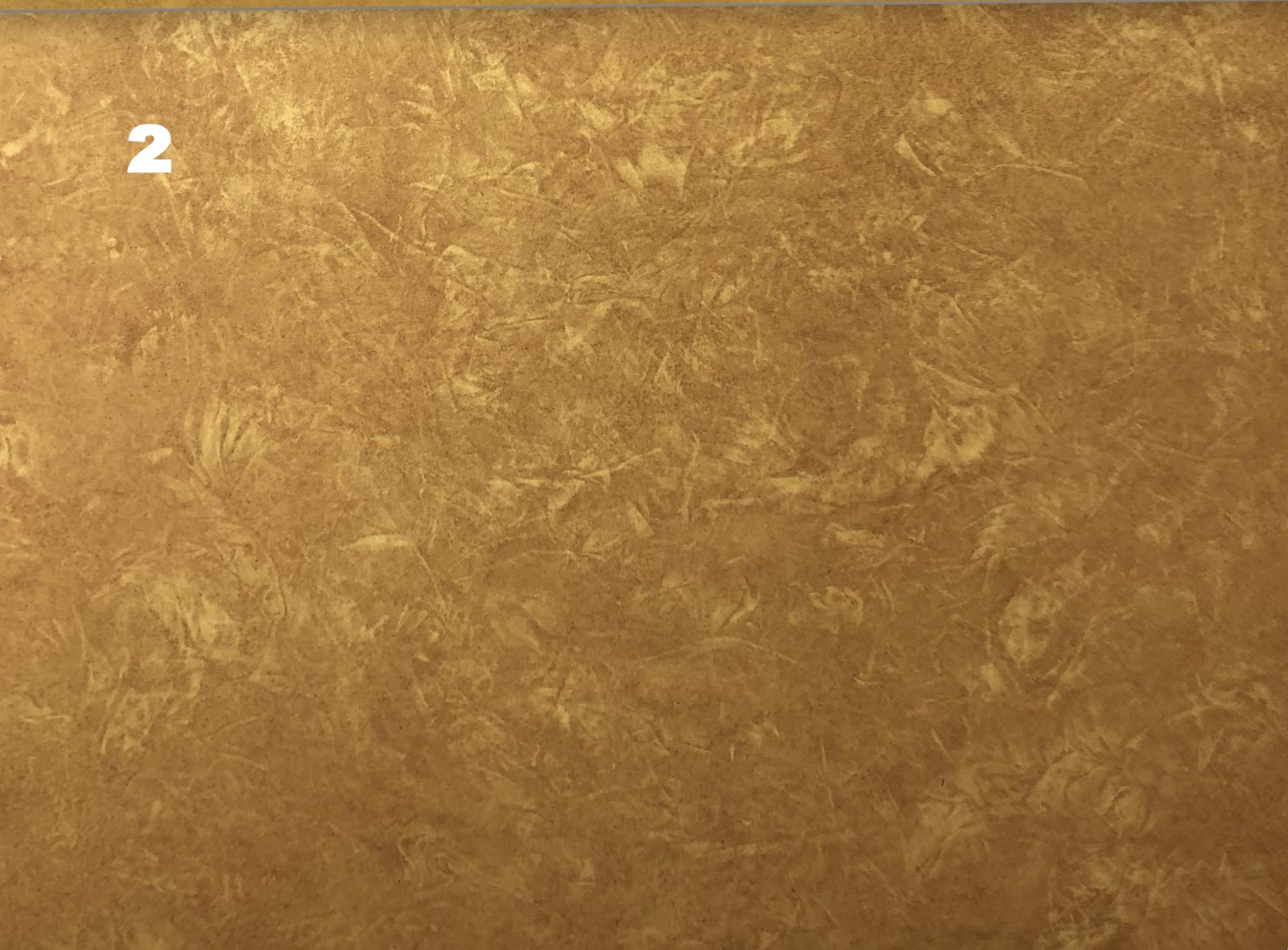
- Step 3
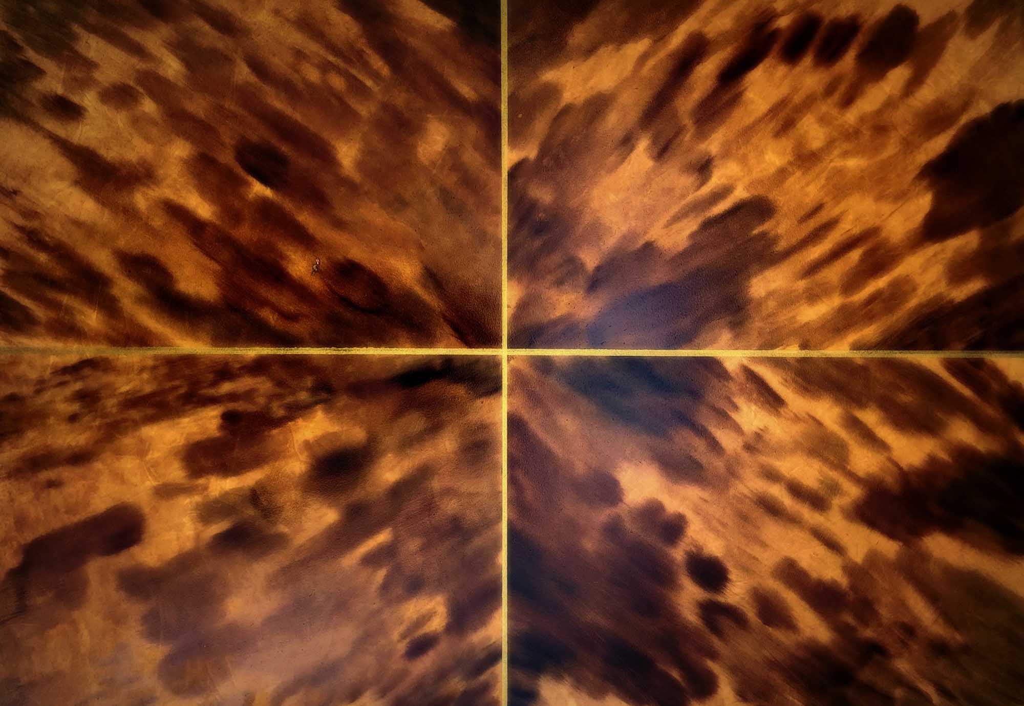
Apply a thin even layer of clear oil glaze. Using a variety of different shaped large artist brushes apply nicely arranged daubs of Burnt Umber mixed with a little glaze. The trick here is to ensure that it doesn’t end up looking spotty like leopard print. Make your shapes varied in both size and form.
Add some more “daubs” of Van Dyke Brown to vary the tone slightly and then deepen some of your shapes with the addition of some Black.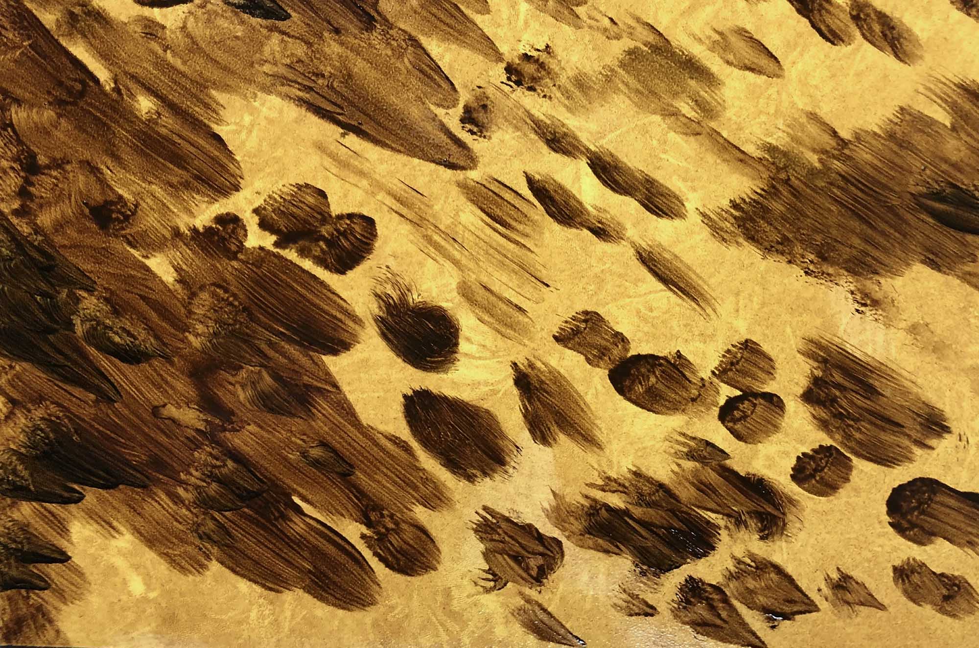
- Step 4
Soften the daubs quite robustly to get that blended directional look. You want to make sure that you start in the direction that you want it to move but then soften it out, so it has that lovely soft smudged look rather than a streaky appearance. Finish off softening back in the original direction.
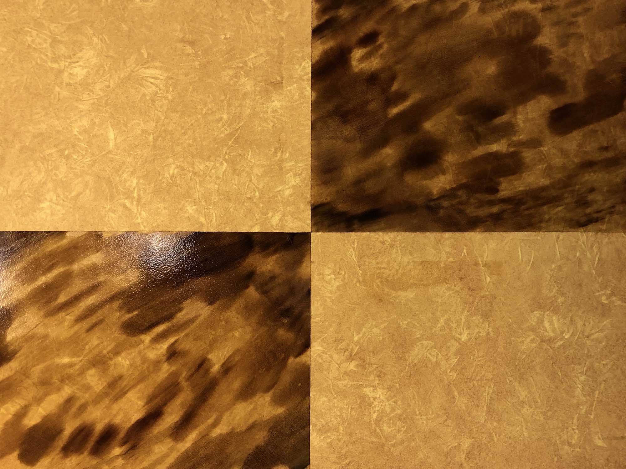
- Step 5
I added some brass inlay lines at the joints of the book matching and instead of using a clear varnish finished it with Osmo Polyx Oil Tints in Amber. Really though how you finish it off is up to you, you could just use a clear satin or gloss varnish.