September 21, 2026
Little Greene launches two collections featuring 26 new colours
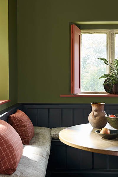
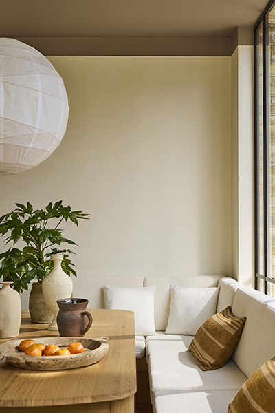

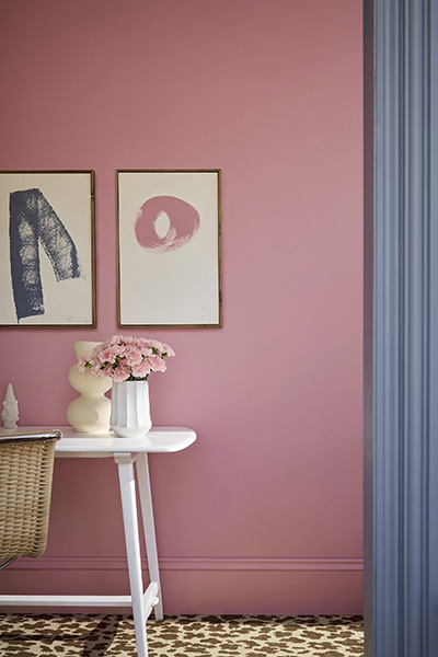
Little Greene has introduced Colours of England and Colour Scales – two collections featuring 26 new colours.
Designed to make choosing colours pleasurable and intuitive for the user, Little Greene’s updated colour cards reflect the changing way we use colour.
With colour confidence central to the Little Greene ethos, the new cards incorporate colours that span over 300 years of historic interior design alongside a palette of contemporary shades which embrace modern interior design aesthetics and provide a multitude of opportunities to introduce depth, character and a considered use of colour.
“Our ‘Colours of England’ and ‘Colour Scales’ collections evolve in line with changing approaches to colour in our homes,” comments Ruth Mottershead, Creative and Marketing Director. “The popularity of colours changes over time; it’s an evolution rather than a revolution, with a movement towards different colours feeling like a natural transition. It’s fascinating to look back to see how colour use has changed throughout history, and to look forwards to predict and then create the favourite colours of the future.”
“The shifting of colour trends is gradual. In 2016, we experienced the use of a lot of blue shades, with blue-based whites and strong blue hues rising to the fore. This move towards blue had evolved from the love of grey that we had seen in the early 2010s. Over the past decade, colour trends have moved through rich blues into teals, then softer, neutral greens, and five years ago we introduced three new bold yellows in response to yellow’s growing popularity and the use of greens encompassing lots of yellow pigment. Bold yellow tones then became deeper and softer, with ochre and caramel rising in popularity, before evolving into a move towards stone-based neutrals and richer indulgent browns, which was in turn followed by a shift into burgundy, deep reds, pinks and aubergine shades which bring intimacy and a quiet sense of grandeur,” adds Ruth.
Little Greene’s new ‘Colours of England’ card featuring 128 shades has been updated, adding 5 new colours to its timeless offering of authentic shades from the key periods in the past 300 years of decorative history.
Alongside the cherished Little Greene signature colour palette, new colours include soft suffused ‘everywhere’ white ‘Haye White’, delicate, stoney plaster hue ‘Parlour’, intriguing and expansive ‘Perpetual Blue’, confident and playful ‘Floss’, and usable yet characterful muted orange ‘Ashes of Marigold’.
The ‘Colours of England’ collection is presented alongside an expanded range of graduated shades in the new ‘Colour Scales’ offering which includes 22 new colours and expanded families of colour for much-loved shades.
Designed to be both inspirational and easy to use, ‘Colour Scales’ treats each colour as one of 18 graduated families of colour, grouped in columns according to undertone. Each ‘root’ colour is accompanied by lighter and darker variations, making coordination very simple. Shades within the same column can be used together for tonal coordination, or across columns to create a balanced contrast.
Ruth Mottershead continues: “These families of colour allow customers to easily create harmonious schemes. By communicating tonal colours in families, we can offer a subtle spectral range that consumers can combine with confidence. The varying shades can be combined to add discreet depth to a room, defining architectural features, or reduce the contrast of walls and ceilings. The deeper shades can be used to complete a coordinated finish that, whilst singular in colour, makes a design statement through an expansive use of tonal colour.”
Not only has Little Greene added new shades, but it has also reformatted the card with the customer in mind. Arranged with warmer, pinker undertones to the left of the card, through to yellow and green, to the cooler blueish neutrals on the right, the ‘Neutral Scales’, which effortlessly help with the selection of colours based on their undertone, are now presented alongside coordinated whites.
“The understanding of, and approach to neutrals has evolved,” comments Ruth. “We have seen a shift; colours are becoming very balanced – neither too cool nor too warm! If they were to sit on the PH scale, they would sit at 5 or 6. This desire for balance of tone has increased the popularity of balanced neutrals such as ‘Portland Stone’. In response, we have introduced a highly complex, easy-to-scheme new neutral ‘Barge Stone’, as well as extended the much-loved warm calico ‘Hammock’, to offer a family of ‘Hammock Colour Scales’ with shades of varying strengths. These new neutrals meet the increasing demand for complex, balanced shades that deliver colour personality.
“We have also experienced a clear transition from caramels, burnt oranges and chocolate brown tones. We have therefore taken the red oxide and intense heat out of our colours to provide gentler shades with less intensity, where the saturation is being turned down, such as ‘Ashes of Marigold’ which is tempered with a touch of black to deliver a warm, earthy terracotta orange.
“Similarly, there is a shift away from cold greens and blues. Once extremely popular ‘Aquamarine’, ‘Gauze’ and ‘Pearl Colour’ have been replaced with a desire for warmer greens and blues that are gentler and more yellow such as ‘Celestial Blue’, ‘Boxington’ and ‘Hammock’.
“Fresh, clean pastel tones are also on the rise, with gelato colours such as ‘Floss’, ‘Parlour’, ‘Boxington’ and ‘Celestial Blue’ increasing in popularity. These light-hearted shades illustrate our desire for gentle hues that feel characterful and joyful without being overpowering or intense.”
Using the same theory of related colour, the ‘Colourful Scales’ section on the right of the colour card introduces shades with higher chroma. Use these grouped families in exactly the same way by selecting shades from the same column to create seamless, harmonious schemes or navigate horizontally for a colour with similar weight but a change in hue.
Stronger individual new colours that both work tonally with existing Little Greene shades and respond to changing colour trends have been added to the ‘Colourful Scales’ section. These distinctive new shades include charming neutral ‘Flight Pink’, luxurious and comforting mid-tone brown ‘Marle’, balanced neutral yellow ‘Elysian Yellow’, delectable caramelised yellow ‘Brûlée’, characterful green ‘Oilcloth’, understated subtle grey ‘Cobble’, deep sophisticated blue ‘Rome’, and warm sage green ‘Hillside’.
“We can’t wait to see how our customers will use these beautiful and deeply characterful new colours to create sophisticated, nuanced colour schemes in their homes,” comments Ruth.
The new colours (with descriptions):
- Haye White™ 346 — a softer, warmer alternative to umber-toned ‘Slaked Lime,’ featuring a small amount of ochre for a warm easy-on-the-eye white rather than a cream.
- Parlour™ 347 — a pinkish off-white similar to ‘Castell Pink’ but lighter and fresher; once used in a north-facing room at Dyrham Park near Bath known as the “Slop’t Parlour.”
- Perpetual Blue™ 348 — similar to ‘Celestial Blue’ but deeper, taken from a surviving paint palette of Sir Winston Churchill’s studio at Chartwell.
- Floss™ 349 — same undertone as, but half the intensity of, ‘Carmine.’
- Ashes of Marigold™ 350 — a softer, blackened version of 1970s-associated ‘Marigold.’
- Flight Pink™ 354 — found on the great staircase at Wimpole Hall, Cambridgeshire; a more neutral version of ‘Split Pink.’
- Marle™ 355 — a mid-tone brown heavy on yellow ochre, softened with black and a touch of red oxide.
- Elysian Yellow™ 356 — used in the decoration of The Chinese House at Stowe, Buckinghamshire.
- Brûlée™ 357 — a caramelised yellow that can act as a deep neutral or a signature accent.
- Oilcloth™ 358 — a green alternative to grey for colour-drenched or neutral schemes.
- Cobble™ 359 — a cooler, more green-based grey in the vein of ‘French Grey.’
- Rome™ 367 — a deep sophisticated blue close to ‘Hicks’ Blue,’ named after a guest bedroom at Mount Stewart, Northern Ireland.
- Hillside™ 371 — a warmer version of Sage Green, linked to Hughenden Manor, Buckinghamshire (Benjamin Disraeli’s former home), and a WWII-era covert RAF initiative codenamed ‘Hillside.’
New ‘Colour Scales’ families:
- Hammock™ (351–353) — warm neutral with umber undertones.
- Barge Stone™ (358–361) — an evolution of ‘Portland Stone’ with a cooler green undertone.
- Celestial Blue™ (364–366) — a dusky variant of ‘Sky Blue’ from a rare 1807 paint card.
- Boxington Family® (368–370) — a reduced lime with added red oxide of iron.